
Story telling is one the most effective ways to growth-hack and stand out. Stories and anecdotes spread easily through the word of mouth: They make your startup memorable and trust-worthy. Stories are what people will love you for.
However just telling your company story is getting old. You need to stand out and grab attentions – visualization is perfect for that.
Visuals have become a new standard for about pages. Some are visualizing the feature of a product, others – the services of a company, and still others are meant to tell about the people behind the startups. Educational sites have also jumped on board, using the unique mixture of visuals and text to relay facts that might otherwise be harder to grasp if the facts were presented in bullet form.
This is good news for graphic designers in particular, giving them a way to creatively stretch their wings and take part in a domain that for awhile was strictly in the realm of web developers and copy writers.
Here are some examples of how websites are now utilizing infographics for more dynamic about pages.
Have A Nice Day Online

Netherlands based Have A Nice Day Online is a group of web and app developers dedicated to providing more effective programs and websites for online businesses. Using their infographic style about page, they present their services, along with their mission statement and some information on past work that summarizes their larger portfolio.
Their bright colors catch the eye, and they pepper in images to enhance their content, rather than overwhelm it.
Motiv App
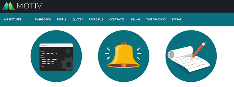
Motiv is an all-in-one business management application for freelancers and small companies who want a way to quickly take care of invoices, contracts, proposals and time tracking. The features page shows a number of screenshots built into the infographic that shows how the site itself works.
Rather that using a multitude of colors, they have stuck with their general branded shades to bring the whole page together, while making it immediately recognizable as their own.
Wildlife
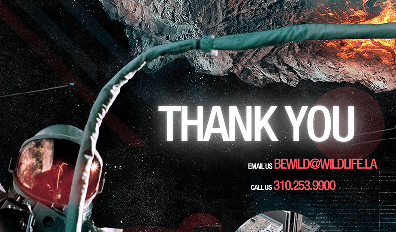
Based on the principle that “technology changes, stories don’t”, design company Wildlife has chosen to present their infographic in just that way: a story. You can move your way downward to see a storyboard of interesting visuals.
The page is also interactive, allowing you to drag certain charts for more information. Other images are animated, giving it a certain flare you don’t often see.
Made By Block
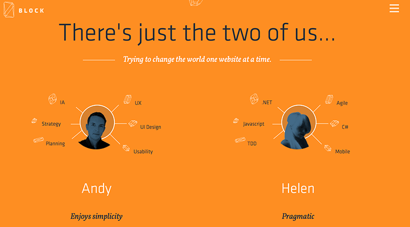
Operating for free for charities and causes, these two developers have an interesting tactic right from the get-go. They introduce themselves with a small, bullet style list of their strengths. One is pragmatic, technically minded, and as black belt. The second is simple, creative, and gets things done. Somehow, seeing this in the beginning makes the rest of the infographic more compelling, because you know right away who it is referring to on a personal level.
The interactive flow chart helps, as well.
Polecat
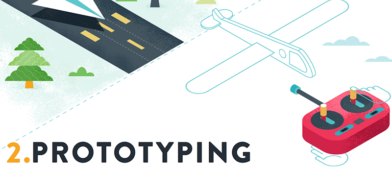
App developers Polecat use a more traditional style of infographic in their about page. It breaks everything down into a section that is dominated by a cartoon image with an explanation at its side. They cover the main beats of their business, and what that means for the customer.
It is deceptively simple, and yet the drawing is so well done that it must have taken a great deal of effort to creative something so basic and beautiful.
Chocolate Coded
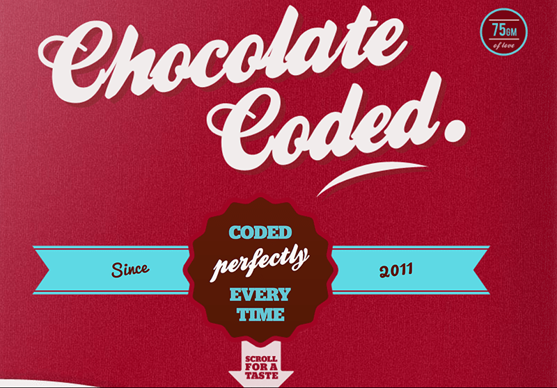
Australian application developers Chocolate Coded find a median approach to their infographic. It is mostly a traditional, static style. But they add in a couple of animations to ‘mix it up’…incidentally, that is the motif of their marketing.
It is simple enough to be informative, but just interesting enough to keep you looking.
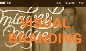
Grain & Mortar
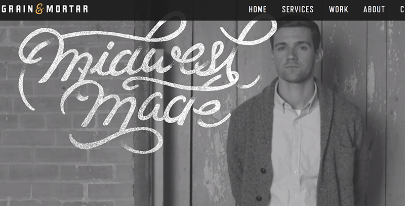
Branding experts Grain & Mortar have a series of infographics on their site, including their services page. But the most impressive has to be their direct about page, where they introduce themselves. It provides each employee with a box of their own, with an image and their professional title. But the photos are great, because they all match one another in a common theme.
It is worth checking out their whole site for some nice examples of infographic work.
Ross Plus Jess
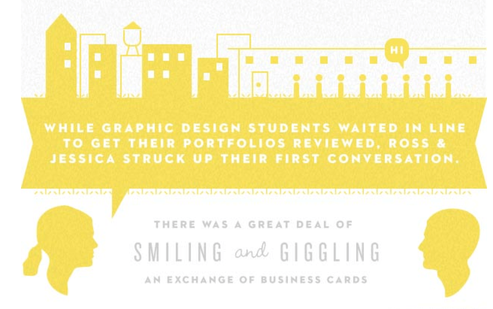
This is the sweetest of all of the infographics on this list. It is a wedding announcement page for a couple named Ross and Jess. They met as design students as they waited in line for their portfolios to be reviewed. This eventually led to an online friendship, which moved to a long distance relationship, which led to Jess moving to the city where Ross was currently living and working.
All of this is presented in an adorable and well made infographic detailing the progression of their romantic tale.
Sequence
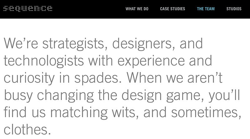
Branding company Sequence has a lot of people on their payroll. These people all do something different, from creative directors, to designers, to marketers. How do you effectively show off the whole team without looking clunky? Making it visual, of course!
Each department has its own section started off by a picture of the person running it. Then to the side, they have headshots against a yellow background of each person in that department. Clicking on the company heads will bring up a bio.
The Livesey Arms

Technically, this is a slideshow style of about page. But because the images remain static unless you swipe them, and because it provides text facts as well, it technically qualifies. This British restaurant shows their food, gives access to the menu, and says who they are on the same page.
The best part about this site is how simple it really is. Yet, it gives you everything you need in a single place, without providing any unnecessary information.
Conclusion
Visuals can be a fantastic way of getting your point across, standing out and telling visitors about a campaign, company or service. Do you have any examples of how this was done to excellent effect? Leave a link in the comments!