
One of Pakistan’s largest mobile network operators, ZONG, has decided to relaunch its brand. The move will primarily see the complete overhaul of its logo along with the repositioning of the brand as well as its overall presence of the brand in the market that they intend to carry out in the future.
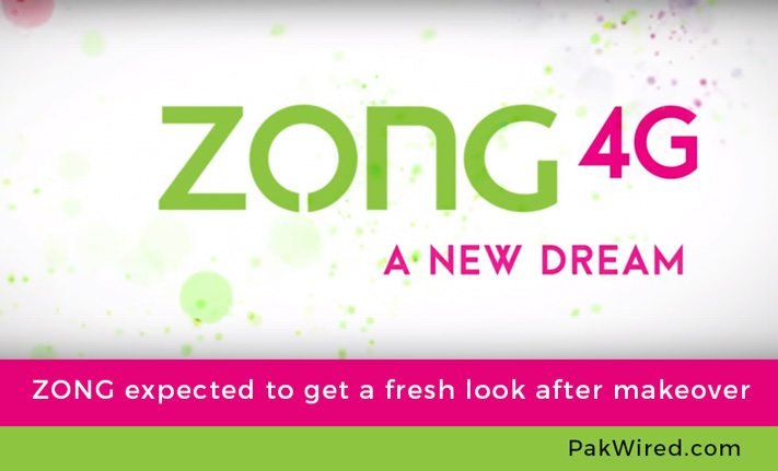
The apparent new logo of ZONG, that is going to be public soon, has already been leaked and has been viral on almost all social media channels. ZONG’s new logo consists of two colors – Green and Pink. These 2 vibrant and bright colors have replaced the old ones – Blue and Red.
Moreover, the tagline has also been altered in the makeover. Earlier ZONG’s punchline was ‘Sub Keh Dou (Say It All)’ and it was quite appealing. However, the old tagline is now replaced with ‘A New Dream’ which is an indication that they are planning to start fresh with something big and are more inclined towards the future.
There is another insertion in the logo and i.e. 4G written next to ZONG. It can be safely assumed that one of country’s largest network operators wants to lead the 4th generation technology in the country.
According to various media reports, the subsidiary of China mobile has got itself a new logo and tagline to look ahead for the future where it wants to position itself as an innovator at the forefront of the digital market.
In a short span of time after starting their operation in 2008, ZONG became one of the most progressive players in the market. This is ZONG’s first major overhauling of their brand. In terms of services offered to their valued customers, there aren’t going to be any major changes however it can be fairly said that the company is on its way to a new chapter in its journey in Pakistan.
It was previously reported that ZONG was also looking for a possible merger when their CEO said that Pakistan should ideally have three cellular mobile operators.