
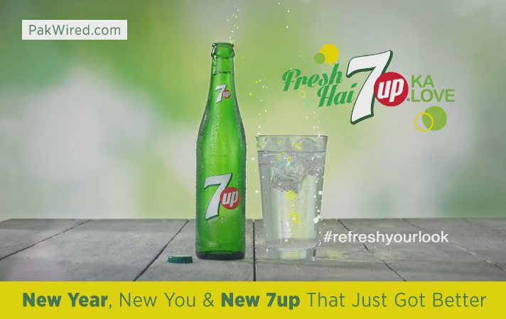
7up is not a new comer beverage by any means. The brand rejuvenated its appearance for the New Year by inaugurating the new 7up logo. The new branding style of the company is immaculate, fresh and attractive. In an obvious attempt to du jour new look, the brand is running a new integrated marketing and advertising campaign with a tagline “Fresh Hai 7up ka love” with official tag #Refreshyourlook.
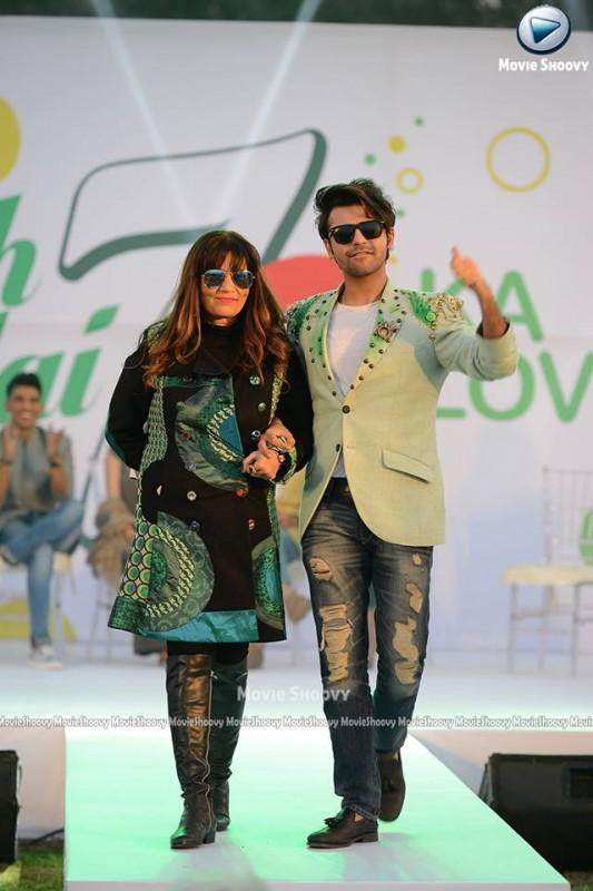
To promote the theme 7up assisted seven Pakistani celebrities, refreshing their entire outlook which was showed at the launch event, organised by CatWalk Event Management and Productions. The PR was catered by Catalyst PR and Marketing. Shammal Qureshi , an expert stylist of Toni & Guy, known to push the boundaries of creativity in hairdressing, styled the who’s who of the music and entertainment industry. Have a look at the video.
The event was kept up by the starry profile of celebrities. The event was attended by Zoe Viccaji, Farhan Saeed, Urwa Hocane, Mohsin Abbas Haider, Anoushay Ashraf, Uzair Jaswal and Sarwat Gillani. Zaid Ali T, a Youtube born star also paid a surprise visit and captured number of selfies with all celebrities.

As ravishing as ever Anoushay Ashraf carried a completely distinct look with dyed shoulder length hair. She excitedly remarked that she was loving her new look as she never experimented anything with her hair before.
Sarwat Gillani for the first time was seen in an event with her red highlighted hair. On being asked about the trendy makeover she shared “I have usually played safe with simple looks being an actor therefore was afraid of bringing drastic changes in my look however this new outlook has given me confidence to step out of the mundane and boring bubble i created around myself”

7up beverage has always been admired for its originality regardless of its revamped look.
We are hoping to see all these celebrities soon in 7up’s new commercial on the “Refresh your look” theme for further promotions, the logo so far is reported to be liked by public.
Regardless, the 7up brand had always been known for its name and the red circle so for me it is now rather more appealing than the previous design which inducted some unnecessary elements. The new fruity logo is neat, minimalistic yet having the retro modern vibe. As it can be seen the new logo reminds of the roots of the brand because of 7 shape, the way it is written and nevertheless the fact that “up” for the first time in decades is typed in small letters.
I personally believe that it is a brilliant redesign, which not only depicts the trademark having a long classic history, but will also help it to stand out over the shelves. The new logo is in line with 7Up’s policy of refreshment however, with time we will be at a better position to comment if it could break it’s historical records.
DISCLOSURE: This post was sponsored by 7Up.